Usability Test Findings
The things that I heard from the user testers was that the overall of the game flow was intuitive and that the landing page is well established. Also, the steps that the game leads the user made them less confused. However, one of the biggest struggles I saw was that during the actual game play, there was not much of visual hints and no exit button which made the user seem stuck at the game board page.
Some of the things that could be improved, according to our user testers, was that the game board should have a greater contrast between the background and the board itself. Also, both user testers were confused who's turn was currently going since there was no indication of who was rolling the dice.
Future Implementations
The biggest change that we need is clarity. I believe that because Nguyen and I were too focused on creating the logic and branding of the game, we excluded users from having a stable and comfortable interaction with the game. So, we would have to modify things that informs users throughout the interaction and let them be a part of the game itself. Along with that, we will have to finish generating the rules, results page, and randomize the questions for better real-life interaction.
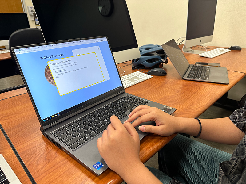
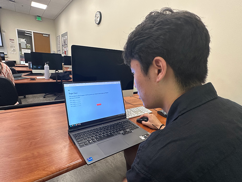
The images below are the user testers interacting with our game during usability the test.

