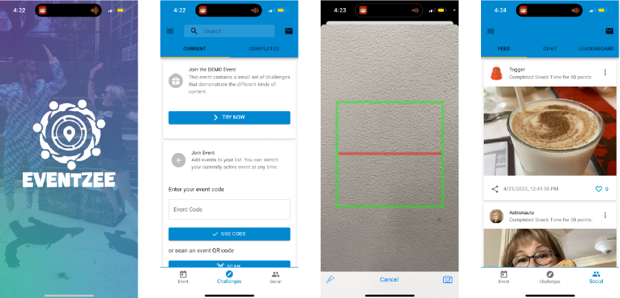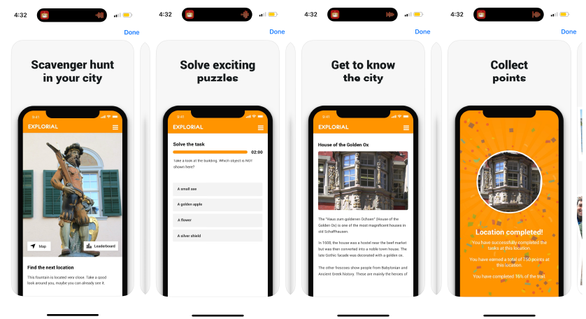
The interface design of the onboarding screen is very game-like, due to the opaque gradation colored filter over an image of two happy people. However, I think that the interface of the inside is not as well designed because the application seems more serious than what it is trying to make users feel; the application is oriented so that the users would feel happy and have fun, but the interface is too serious.
Also, navigating between different sections of the application was slightly confusing since there were tab bars both at the top and the bottom. Although the design aspect could have been better, I still thought that the social media part of the application was interesting. It seemed like it motivated people to complete their tasks and show other community members of their achievements.
